
- All
- Product Name
- Product Keyword
- Product Model
- Product Summary
- Product Description
- Multi Field Search
Views: 0 Author: Site Editor Publish Time: 2026-11-11 Origin: Site


A jewelry box looks most premium when its surface, logo and interior work together at the scale of the piece. A matte wrap with a small foil mark is a useful starting point for a refined retail collection. Textured paper with a blind deboss suits a more understated identity, while velvet shifts the emphasis to touch and the moment the lid opens. The finish that wins on a swatch can lose on a small box once the corners, logo detail and insert are visible. Compare finished samples under the light your customers will actually see.
Start with the surface that covers most of the box. Its texture and sheen set the visual tone, and they influence whether small graphics and fine details will read clearly. A quiet surface can give a small mark room to breathe. A highly reflective surface becomes a larger part of the design because it changes with every angle.
A smooth matte wrap gives the designer a relatively even field for type and a restrained overall appearance. It works well when the jewelry collection already features reflective metals or stones and the outer box serves as a quiet backdrop. On a dark wrap, check corners, lid edges and finger contact areas for marks. The appearance can depend as much on how the sample was assembled and handled as on the finish named in a quote.
Soft-touch film or coating gives a smoother tactile effect. Buyers comparing it with a standard matte finish should handle both samples after normal packing and shelf handling. Look for visible rub marks and changes in sheen where the lid is repeatedly opened. If the design will also use foil or spot gloss, proof the full combination on the proposed surface. The feel of the film alone tells you little about how a particular foil will transfer onto it.
Textured paper gives an unprinted lid visual interest, especially when the logo has broad forms and open spacing. The depth and direction of the texture affect the way it catches light. A dense pattern can swallow fine lettering, particularly when the ink or foil has weak contrast. Use the actual mark on the chosen paper before deciding how small the logo can go.
Choose one treatment that communicates the intended effect. Foil adds a concentrated highlight. Embossing and debossing use depth to make a shape visible. Spot gloss creates a sheen difference against the surrounding surface. These options can look similar in a front-lit mockup, yet behave quite differently in the hand.
Treatment | Visual effect | Good starting point | What to inspect |
|---|---|---|---|
Metallic foil | Defined reflective mark | A small monogram on smooth matte stock | Edge sharpness, filled counters and glare |
Blind deboss | Recessed mark with a quiet shadow | Simple artwork on a textured or solid-color wrap | Legibility in diffuse light and depth consistency |
Emboss | Raised artwork | A broad symbol with enough open space | Relief, edge definition and alignment |
Spot gloss | Local sheen change | A larger pattern over matte artwork | Registration, visibility at an angle and marks after handling |
Velvet or flocked surface | Soft appearance and directional texture | Presentation boxes where touch matters | Lint, pile direction and consistency at edges |
Hot foil stamping transfers a thin decorative layer from a carrier using a heated die. The artwork that looks crisp as a vector file may produce cramped details when scaled to a ring box. Check the gaps in letterforms and the spaces between strokes. The foil shade can also look warmer or cooler next to the actual wrap than it did against a white swatch card.
Blind debossing leaves a recessed mark with no added ink or foil. It depends on shadow, so compare a sample at eye level and from above. Embossing raises the mark and can give a bolder motif presence. Have the converter confirm the sequence of wrapping and decoration and provide a finished sample. That matters if relief is close to a lid edge or if a foil layer must align with the raised detail.
Spot gloss is worth exploring when you want a motif to appear as a lid is tilted. If a logo needs to read immediately across a counter or in a straight-on photo, compare the gloss treatment with a printed or foiled version at the same size. Brand teams often benefit from approving a physical reference under diffuse and directional light, especially for dark-on-dark work.
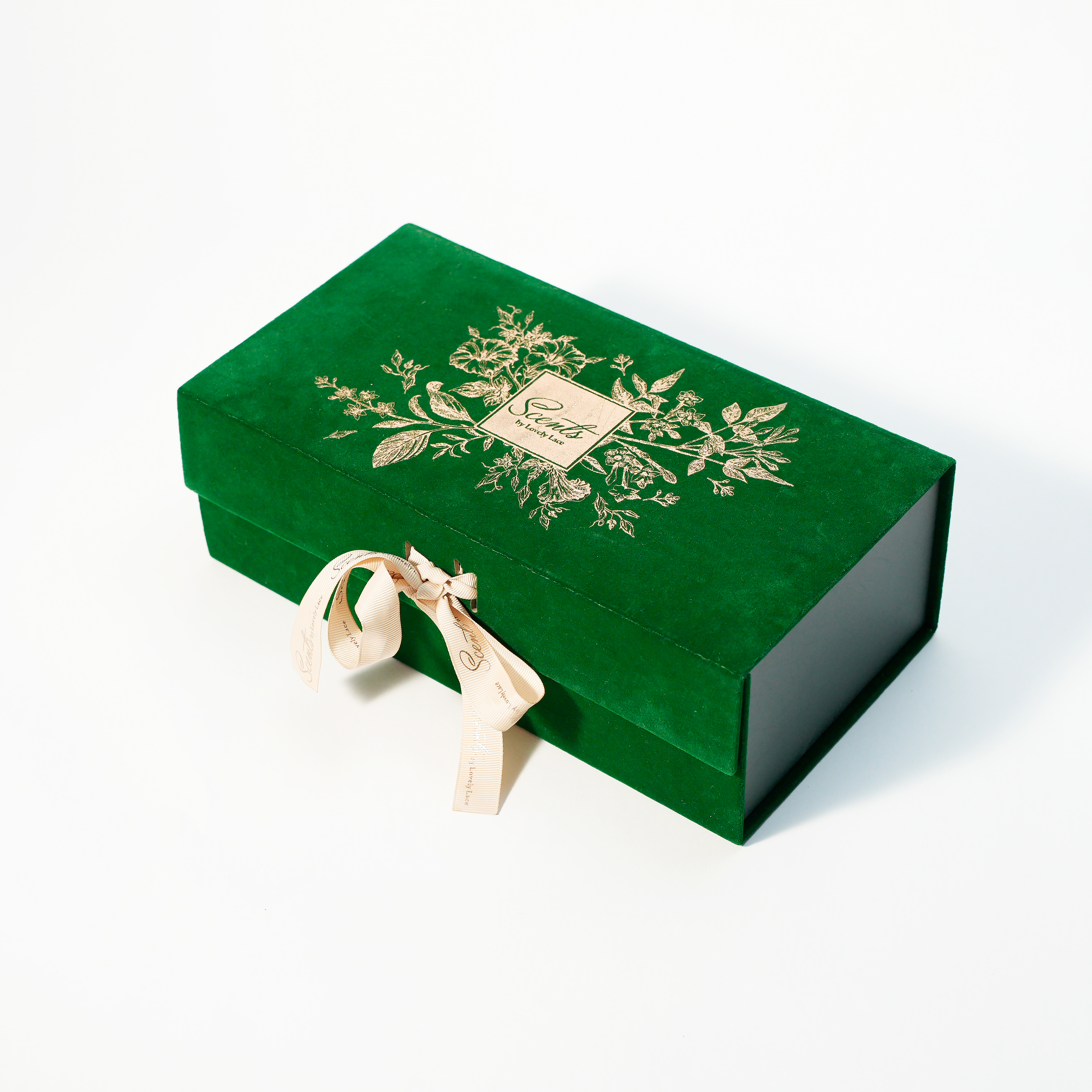
Choose the insert color and texture alongside the lid finish. A package can look polished from the outside and lose that effect if the piece sits off-center, the insert has a visible gap or the material hides important details. For jewelry boxes used on a counter, open the box from the customer's position to see what appears first.
The velvet jewelry favor boxes combine a velvet presentation with a soft velvet lining. Logo, color and pattern customization give buyers ways to coordinate the package with a collection. Use a real jewelry sample to judge the pairing. A pale stone may show its outline more clearly against a darker insert, while a dark piece can benefit from a lighter field. Reflective jewelry should also be checked under the store's lighting and in the photography setup used for online listings.
A ring slot should hold the band upright without excessive insertion force. A necklace arrangement should keep the chain from drifting across the pendant during routine handling. With earrings, check whether posts or hooks can touch each other or catch on the lining when a customer removes them. These checks tell you where the insert needs a structural adjustment. They also help you avoid redesigning the exterior when the real problem is the way the piece sits.
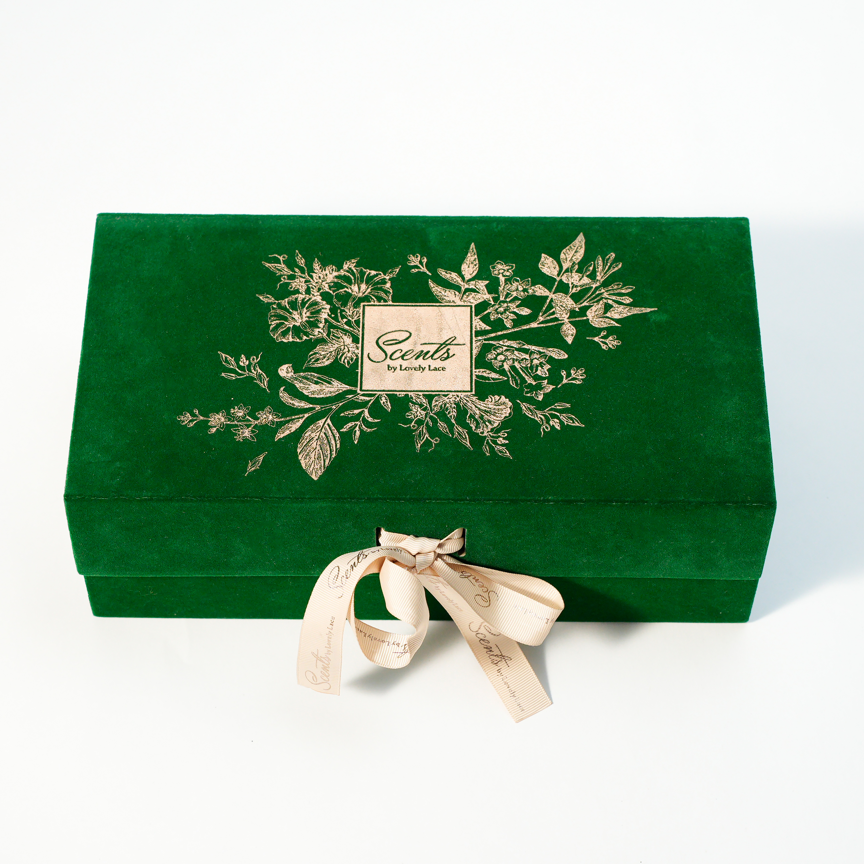
Choose a repeatable combination for the smallest box in the line, then adapt it for larger formats. The wrap, logo size and distance from an edge should each have a reference. A pendant box has more space to display a broad pattern, while a ring box can look crowded with the same elements scaled down together.
For a fine-jewelry counter, start with matte or textured stock and one small focal mark. Decide whether a metallic highlight should echo the jewelry or provide contrast. For seasonal gifting, the same structure can carry a more expressive color or a broader glossy pattern. Custom lidded favor boxes are a related paperboard option with matte, glossy and metallic finishes, useful when the project also includes favors or companion gifts.
Ecommerce adds a different inspection point. A highly reflective lid can become difficult to photograph with the jewelry visible, and rubbing in the shipping pack can show up on an otherwise attractive surface. Put the closed jewelry box into the proposed mailer, check contact points and photograph a sample before and after routine packing. Inspect inserts after a representative journey or handling simulation, too. A presentation box should be evaluated as one component of that parcel.

Use the sample review to turn aesthetic preferences into observations a supplier and buyer can repeat. Give reviewers the same box, lighting, reference artwork and jewelry. Compare the most demanding combination first, such as fine silver foil on dark textured stock or a deboss close to a lid fold.
Identify the wrap and finish by reference code, with a physical sample showing the approved color and texture.
Mark the logo size, orientation and position on the dieline. Show the acceptable placement range on an assembled reference.
Check the top, edges and corners under a side light. Look for exposed board, uneven folds, visible adhesive and changes in sheen.
Open and close the box several times. Examine the grip area, hinge or lid fit and the surface where the lid meets the base.
Load the actual piece and take a front-facing photo of the opened box. Confirm the logo and jewelry each remain easy to see.
Keep the approved reference for the order and identify which changes require a new proof.
For a second order, review a new sample if the wrap, foil supplier, insert material or decoration process changes. A production reference also helps when ordering several sizes from the same jewelry box range. Compare the color and sheen across sizes together. An acceptable match on each box individually can still feel inconsistent once the full collection is displayed in a row.
For a refined jewelry box, start with one well-executed surface and one deliberate accent. Smooth matte and a restrained foil mark work when the logo needs a clear highlight. Textured paper and a blind deboss suit broad, simple artwork, while velvet can bring more attention to the opening and the feel of the package. Xiamen Shengge Packaging Products Co., Ltd. manufactures packaging for retail and gifting projects. Use finished samples with the intended jewelry, then make your final decision from the smallest artwork, the most visible edge and the presentation under real lighting.
Matte finishes tend to show broader, softer reflections. Glossy lids can work in product photography when the light can be diffused and the box angled to keep glare away from the mark. Photograph a finished sample before choosing a finish for a catalog or product page.
Some structures can accommodate that design, but the transition over a fold can affect the mark. Ask for an assembled proof with the foil in its intended position and look at the corners after repeated handling. A flat proof cannot show what happens at the folded edge.
A coordinated palette is usually enough. Match the outer wrap to the brand identity, then choose an insert that shows the jewelry clearly and holds it securely. A different texture or a deliberate tonal contrast can make the opening feel more considered.
Use real foil swatches and apply shortlisted shades to the final box wrap. Compare them beside the jewelry and any printed brand colors. Look at each in daylight or diffuse light and under the warmer lighting used at the display.
That can work if the mark fits every lid with good margins and legibility. Use a full-size layout for each box and inspect the smallest finished piece. A second die can be worthwhile if the shared logo crowds the small format or looks lost on the largest one.


